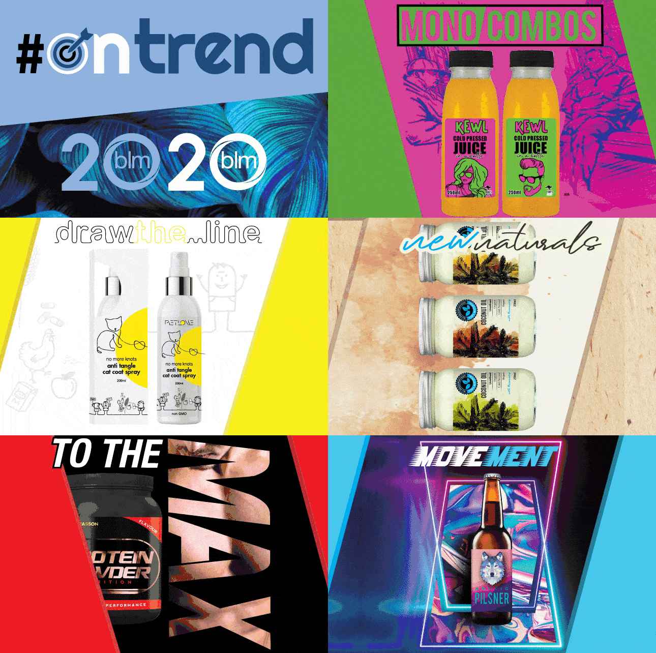
Understanding the latest trends in label and packaging design keeps you at the forefront of the hottest and most engaging looks. Consumer attention is scarce and critical. Packaging needs to get attention for the right reasons. Outdated or label design that packaging.
Here are the trends we think will really make an impact in 2020:

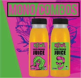
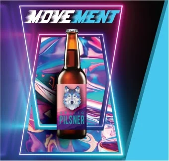
| mono combos Creative monochromatic & cyberpunk colour schemes share a sense of bright, oversaturated colours that are not seen in nature. They are both modern and futuristic, yet aesthetically appealing to an audience craving visual engagement. While they seem an extension of duotone, these techniques have evolved into more stylised versions that use colour filters on photos or partial elements of the composition to create fun and visually exciting designs. |
|
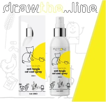
 | draw the…line Our world is filled with many messages. Designers are using illustrations & line art to convey concepts and ideas. By removing complex details and imagery, your focus isn’t on the image, but the message it conveys! Combining images with illustrations pays homage to collage’s technique of combining line art & simplistic illustrations to create a customised & hand-crafted feel that many brands are chasing. |
|
 | ordered chaos Simple & structured layouts have a strong visual appeal and lend themselves to a sense of balance and order. When combined with liquid shapes and avante-garde imagery they form eye-catching designs that are both artistic and functional. Great structure encourages interaction & separation of product variations through typography, iconography, illustrations & colour. Done well they are easy to read and create a stylised sense of ordered visual chaos. |
|
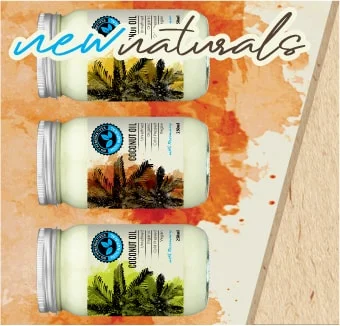
 | new naturals As sustainability becomes an imperative, brands look to utilise more ‘earth-inspired’ designs and colour palettes. No longer just the realm of organic food and personal goods, this trend is seen to grow across many industries. The standard, subtle and earthy tones in greens, blues and browns are now being combined with highlight colours, iconography and typography to reinforce and compliment the ecological and sustainable themes. |
|
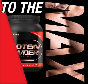
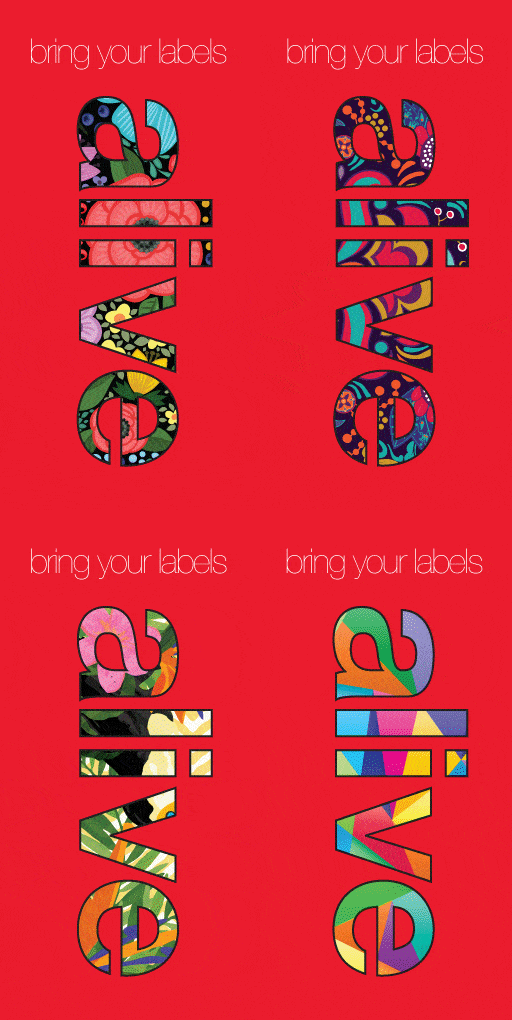
 | to the max MAXI fonts & typography + Image & Text Masking & Split-lining of text and words is expected to be HUGEthis year. Text & typography in shapes is also making its way into a wide array of creative designs. Image & Text Masking isn’t new, but is evolving to create a dynamic aesthetic. Combined with MAXI typography it creates a magical combo of minimalism with maximalism. BAM! |
|
 | movement In addition to 3D depth & realism, designers are combining flat 2D designs with other realities to create truly engaging experiences. It is all about colour and movement. Tying elements of the real world with the packaging of products and objects. Carry this through to the unboxing experience and link to the web & other designs using moving gifs, animations & videos & you create an advanced visual that truly comes ALIVE in other worlds. |

